#gimp image editor
Explore tagged Tumblr posts
Visit Tumblr Blog
Explore Tumblr blogs with no restrictions, modern design and the best experience.
Last Seen Tumblr Blogs


Fun Fact
Tumblr has been providing a Korean-language service since 2013.
Text
23 notes
·
View notes
Text

Lesson learned. You'll want to be VERY specific when searching the web for this.
1 note
·
View note
Text
I think I found a way to estimate how my tattoos would age using GIMP.
Here's why I did it.
I have one tattoo with a lot of fine lines and details. Yes, it was a bad idea. It's healing about as well as you'd expect, which is NOT WELL.
This is the tattoo I want
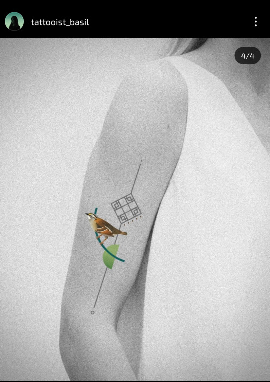
I really really love this but the sparrow makes me really nervous because it's a small thing with a lot of details that rely on color contrast. It's hard for me to get a sense of how these types of tattoos heal based on her account.
Because I definitely don't want it to heal like THIS (which is only two months after the tattoo)
But I wouldn't mind it healing like this other, much more complicated tattoo from this healed pic reel
So, let's try estimating how this might heal on my skin in the worst case scenario using GIMP.
I verified this method against my existing tattoo. I found a picture of when the tattoo was fresh. Then I faded and blurred that original image until it looked kind of like what that tattoo looks like now. I'm not going to post a picture of that tattoo for information security, but I can show how I replicated that in a different design to try to estimate how that tattoo would age.
Here's a screen recording of how I, a GIMP noob, did it. Sorry about all the floundering
If you DON'T want to watch me struggle with GIMP, here's what I did
Load the tattoo image
Set a background layer that has the same color as the main color of your skin, or in this case, the same grey-scale the arm color is in for the sample pic
Play with the opacity of the tattoo layer until it looks about reasonably faded
Blur the image using a median blur, play around with Radius and percentile to simulate how the colors would melt into each other, and how the line would bleed into the skin
I think this is about how bad it would be a few months if this tattoo heals as badly as my other fine line tattoo
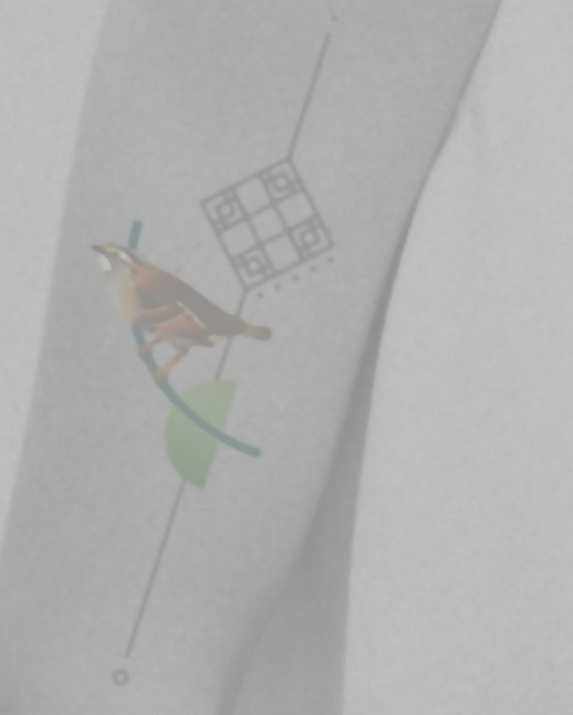
And this would be how badly it might heal in a few decades (I'm just randomly playing with the blur tool at this point, so take it with a HUGE grain of salt)
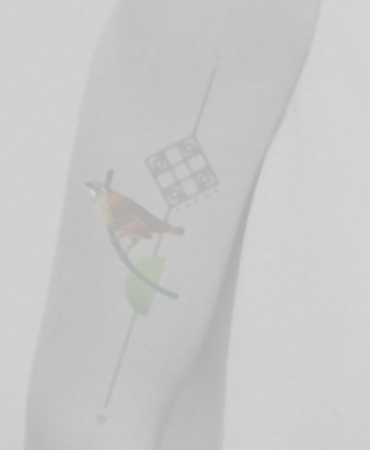
Looking at this, I'm feeling pretty optimistic? There's enough shape of a bird that I think, even if the colors fade and bleed into each other, it'll be enough to show that it's a bird perched on a branch against a traditional Korean knot.
Of course, this might also heal like my other tattoos which use the traditional (?) thick, bold black lines and restraint around adding too many details. Those tattoos are all between 2 years ~ 7 years old and still look about the same as it did on the day I got them.
Anyway, takeaways: 1. I am a huge wimp and do not want to get touch-ups. I should not get small tattoos with a lot of details, and definitely not ones where the artist likes fine lines
2. Bold really does hold
3. I think the tattoo I want would still hold ok? I should really think about whether I want to shell out top dollars to get a tattoo I'm kind of concerned about vs going back to the artists who I know can give me art that will hold up for a while.
0 notes
Text

GIMP 2.2
289 notes
·
View notes
Text

artist asking the real questions from the fave be like
it hurt itself in its confusion
anyway yeah can we get like,,, an actual story here? thanks
#keigo takami#bnha hawks#mha hawks#Kate arts#I need a new image editor bc fucking HELL gimp keeps using the bucket in a transparent was OR the edges ain't sharp ughhhh#yeah this is still for something else but it looks bangin enough to post in itself#bnha fanart
9 notes
·
View notes
Text
Here's a list of Free tools and resources for your daily work!🎨
2D
• Libresprite Pixel art + animation • Krita digital painting + animation • Gimp image manipulation + painting • Ibispaint digital painting • MapEditor Level builder (orthogonal, isometric, hexagonal) • Terawell manipulate 3D mannequin as a figure drawing aid (the free version has everything) • Storyboarder Storyboard
3D
• Blender general 3D software (modeling, sculpting, painting, SFX , animation…). • BlockBench low-poly 3D + animation.
Sound Design
• Audacity Audio editor (recording, editing, mixing) • LMMS digital audio workstation (music production, composition, beat-making). • plugins4free audio plugins (work with both audacity and lmms) • Furnace chiptune/8-bit/16-bit music synthesizer
Video
• davinciresolve video editing (the free version has everything) • OBS Studio video recording + live streaming.
2D Animation
• Synfig Vector and puppet animation, frame by frame. Easy. • OpenToon Vector and puppet animation, frame by frame. Hard.
↳ You can import your own drawings.
For learning and inspiration
• models-resource 3D models from retro games (mostly) • spriters-resource 2D sprites (same) • textures-resource 2D textures (same) • TheCoverProject video game covers • Setteidreams archive of animation production materials • Livlily collection of animated lines
746 notes
·
View notes
Text
I just found out that pretty much all mipmaps in sims 2 cc are too blurry


While working on my package editor (which I'll make a post about later) I found out that pretty much all DXT-compressed textures in sims 2 cc have blurry mipmaps! Meaning that for most textures, if you zoom out slightly the texture will become blurry.
What, why, and how
Meepmops? What are those and why would I care?

Mipmaps are used in computer graphics to make textures look smoother when viewed at a distance. There is also some evidence that having mipmaps might help with texture memory (post by @episims). In essence, you take the original image and then combine four pixels into one to create an image that is 2x smaller in width and height than the original, then repeat this process until finally you get an image that is 1x1 pixel.
One complication is that mipmaps will not work if the smallest texture is not 1x1 (post by @pforestsims) meaning that if you don't have the maximum amount of mipmap levels possible, the game will only use the largest texture. This is a good thing, because that means the game will reject malformed textures, but it also means quite a lot of textures with mipmaps in cc don't actually work correctly.
That's also why you shouldn't make images which are not a power of two; if it's not a power of two you can't keep dividing the image by two to end up at a 1x1 pixel image, meaning you can't make proper mipmaps.
Why are the mipmaps blurry?
After some experimentation I've managed to find the cause of the blurry mipmaps:
All mipmaps made with Nvidia DDS Utilities are blurry. Yes, you read that correctly. And yes, it's exactly as bad as you're imagining.
For the uninitiated, Nvidia DDS Utilities has been the primary tool that sims 2 cc creators use when importing textures for pretty much as long as the game has been out. In SimPE you would click the texture, then select "Build DXT..." and that would open the dds utilities and allow you to import the texture.
So how many files are affected? By doing a scan of a 20GB downloads folder that was graciously donated to me I could get some raw numbers on the amount of textures that might be blurry. Let's have a look:
total textures: 107892
number of textures compressed in DXT: 98683 (91%)
number of DXT textures that have mipmaps: 69527 (70%)
DXT textures with not enough mipmaps to show up in game: 54709 (55%)
overall, 54709 out of 107892 (50%) of textures in this folder are blurry when zoomed out in game
How do I fix this?
Here's the good news: you can fix this! Kind of.
First of all for cc creators, let's take a look at how you can make good looking mipmaps.
The process is pretty simple: open the original texture is GIMP, export the texture, then select DDS as the format and use the following settings as a reference.

Now in SimPE right click the image, select "Import DDS..." and open the .dds file that you've just exported.
Now it is possible to do this process by first exporting the texture from SimPE, but the mipmaps that creates will never be as good as the ones made from original texture, along with it being an absolute massive time sink to do that on every single downloaded texture.
In a little while I'm going to officially release my package editor yape, which will hopefully make the process a little easier, and after that I'm going to look into adding an option into my texture search tool batl to recalculate the mipmaps for all the textures in a folder, but for now the GIMP export process sadly really is the easiest way.
104 notes
·
View notes
Text

Create Your Own Main Menu for The Sims 4 - Tutorial
Hey folks!
This tutorial will walk you through creating your own main menu override for The Sims 4 based on my custom repository.
_________
What is required:
JPEXS Free Flash Decompiler
Sims 4 Studio
Raster graphics editor (e.g. Photoshop, Gimp, Photopea)
Your Own Main Menu repository
_________
Step 1: Download and unzip the Your Own Main Menu repository
It's available on my Patreon page for free.
_________
Step 2: Prepare your custom images
There are two images that you need to customize:
SimMattically_YourOwnMainMenu_MainBG.pngThis is the main background image, where you want to put the desired graphic.Size: 1440px x 1200px
SimMattically_YourOwnMainMenu_BarBG.pngThis is the second background for the navigation bar on the right.Size: 480px x 1200px
Prepare your own images based on these templates. Do not change the size of the images.
Tips: If you're using a more complex background, such as a screenshot from your game, I recommend blurring the Bar_BG with a Gaussian Blur (~60px). Additionally, I suggest adding a white overlay with ~50% opacity and a 5-pixel wide white bar on the left edge with ~10% opacity. This helps improve the readability of the navigation bar buttons and adds an extra layer of detail to your menu design.

The repository also contains the optional file "SimMattically_RefreshedMainMenu_ScenarioButton.package" from my other mod, which replaces the Scenario button icon with a semi-transparent white version. It's up to you whether you want to use it.
_________
Step 3: Import the images to the .GFX file
Firstly, open JPEXS Free Flash Decompiler and then open my SimMattically_YourOwnMainMenu_Template.gfx with it.


Select "No to all" when prompted.

On the left, choose "images" and scroll to the bottom where you will see the images you just edited in their original form. Right-click on each and select "Replace." Select the custom images you prepared in step 2.


Save the file.
_________
Step 4: Import the .GFX file into the .package file.
Open Sims 4 Studio, then click on "My Projects" and open SimMattically_YourOwnMainMenu.package. Select "Scale Form GFX" (the one with the "gameentrylauncher" description) and click on "Import." Select the modified .GFX file and import it. On Windows OS, you need to switch from .binary to all file types to see the file.


Save the .package file via File -> Save As... Give it a custom name and place it in The Sims 4/Mods folder.
That's it! Enjoy!
_________
IMPORTANT INFORMATION/TERMS OF USE:
Main menu overrides can become outdated with some game updates, causing them to break the game. You will have to remake your custom main menu with a new, updated template in this case. Always make sure you are using the latest available template and that it's not outdated.
Since these mods can break the game, I do not advise sharing your custom main menus with other players. You are free to do so, but be aware that since you're relying on this repository to create your own version, you most likely won't be able to update the mod and resolve issues for other players on your own, so you take responsibility for breaking their game.
If you decide to share your version with other players, please credit my repository and link to my Patreon post.
Do not put your custom main menu based on this repository behind any paywall or early access. I made this repository and tutorial free for everyone, so keep it fair.
I do not take responsibility for people misusing this repository or breaking your game with incorrectly modified files. I do not provide support for custom main menu overrides created by other creators using this repository.
_________
#sims#thesims#thesims4#sims4#sims 4 mods#sims 4 custom content#simblr#s4cc#ts4#main menu override#sims tutorial
314 notes
·
View notes
Text
#tumblr polls#best thing ever#tournament poll#gimp image editor#the mortifying ordeal of being known
16 notes
·
View notes
Note
hi goat! do you have any tips/ideas on making 4t2 items look less plasticky? would new textures work or is it maybe something with the shading? or maybe it's the rounded edges on everything....
hi anon! I know you sent this a while ago. Thanks for waiting. I do indeed sometimes retexture TS4 converted objects.
I am no expert! But! Here's what I usually do:

For this tutorial, I will be using @janika31's 4t2 conversion of the Siten-Ze Reclaimed Wood Sofa.
It has the rounded edges you speak of (typical of TS4 objects) and a texture that could be considered 'plasticky' too.

What you will need to do first is open SimPE. We need to be able to look at this mesh nice and close!
When the mesh is opened in SimPE, go to the 1. Geometric Data Container and click on it 2. find the main object in the Models list (sofa) and make sure it's checked 3. Export the object.

You'll need to load said object into a 3D Modeling program in order to look at it.
I like UVMapper, because it's free (well the free version is anyway lol) and it's very easy to use.


While you're in SimPE, extract a texture or two from the original object. You will need them. Light or white recolors will be useful.

With the object loaded into UVMapper, this is what it looks like!
UV map of the object on the left, object (with no texture) on the right.

Add the texture in.
UVMapper is going to be our main working area. Other than an image editing program like Photoshop or Gimp. You'll need that too.


Let's get a good look at this base texture - we can see it has the wood parts of the couch, the main couch texture and some pillows.
If you find UV maps helpful (I do!) you can extract one from your 3D program.
With UVMapper, I needed to make sure that I've specified the size of the image so the UV map will match. This texture is 512 x 1024.

Now for the fun part! You should be able to copy in the base texture as a new layer, and then delete everything that is not the wood part on the UV map.
I've actually missed the foot of the couch here, but I will fix it.

If you're not already working with a white texture, make one. I like to use @pooklet's Primer and Time Bomb for this.
This white texture is very important as it will serve as the shadow and highlight that the new wood texture will be sandwiched in between.

With the new white texture created, when loaded into UVMapper and displayed on our couch, it looks like this. ^

This rounded edge here, this is a problem area!
With retexturing clay hairs, we want a rounded or 'bumped out' part of the mesh to be highlighted, to give the illusion of shine on hair.
But in objects, especially wood ones that we'd prefer to not look like plastic, we want the opposite effect; this shine should be reduced.
This is pretty easy to remedy in your image editor! But first:

Remember how I talked about how the white base texture was going to sandwich the wood texture? Here's what that means (layers):
1 The white base texture, Normal, 100% opacity
2 Our wood texture. This is something lifted from a Maxis endtable?
3 The white base texture, Multiply, 100% opacity
4 The white base texture, Overlay, 22% opacity
5 The white base texture, Soft Light, 22% opacity*
Optional layers: 1) another white base texture, Multiply, 100% opacity if this is a dark recolor, as it will add more depth 2) the base texture, but in an orange or yellowy color Multiply, 100% opacity (when this is added, it will help when a warm recolor looks too ashy)
*these percentages of how opaque the layer is are arbitrary. They work for me, do what works for you.
Okay! Back to the 'problem area'

This highlight here ^ on the rounded arm of the couch; if you don't want it, here is what I would do:


Locate where that highlight is in the texture. Found it!

Here's how to REDUCE that shine:
1 Locate your base white wood texture layer, Normal opacity.
Notice how the whiter part of this texture, when layered as I've described (Multiply 100%, Overlay 22%, Soft Light 22%) translates as shiny when it's laid on an object.
The way to make that appear less shiny is to make it less white. Less white means less of that shine that can read as artificial aka plasticky. When you make that more grey than white, more of the background wood can show through the semi-transparent layers.
2 Take that noticeably white part of the base texture and make it grey! Copy a chunk of the greyer texture, paste it on, blend in or erase the edges to make it look smooth. Merge the layer.
3 Change your Normal white base layer (now edited to be greyer in that one specific spot) and copy that as 3 new layers: Multiply 100%, Overlay 22%, Soft Light 22%. With the wood texture underneath all of them. Base, wood, Multiply, Overlay, Soft Light, in that order.

Before...

...after! it's subtle okay

The same kind of sandwiching method with image layers can apply to the cushions too.

There! A method for retexturing TS4 conversions that helps them not be as plastic looking. 😊
One last tip before you go off and try retexturing conversions yourself: @pforestsims's Easy Shine Removal kit for SimPe. A must if you're looking maintain that matte look.
Let me know if you have any questions!
136 notes
·
View notes
Text
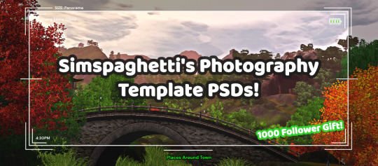
First of all, I want to say thank you so much for 1000 followers - that is truly a bonkers number I never thought I'd reach, thank you to everyone who interacts with my posts or follows along with my legacies or just occasionally sees my posts on your dash - I love this community so much, and I've felt so welcomed here since I joined simblr!! Mwah ily!
I come bringing gifts!! It's another PSD template, based off of the photography UI for Sims 3
I got the idea for this template way back when I was taking these screenshots in Gen 1 of my Blossom Random Legacy, and I figured they could really come in handy for people who are doing world adventures style gameplay :)
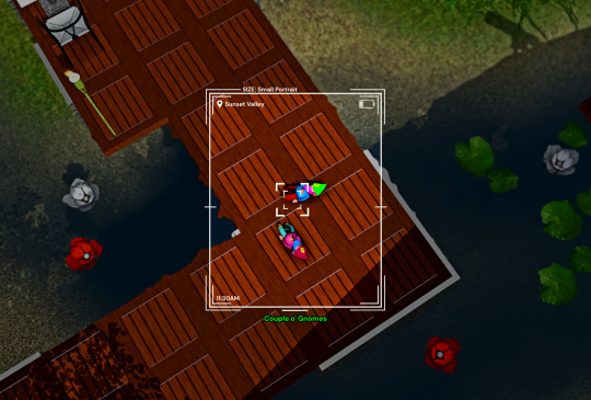
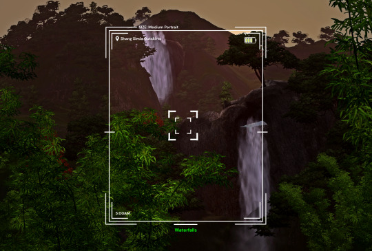
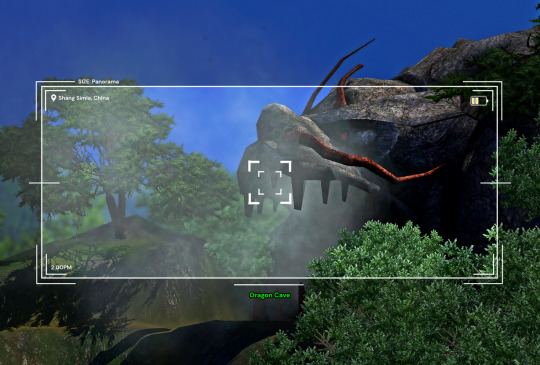
There are 4 sizes to choose from, each one is loosely based on a photo size in the game:
Medium Landscape Medium Portrait Panorama Small Portrait They're all on a 1450x980 canvas, but you can of course crop them however you want!
It's also pretty easy to create your own custom size if you want to, as long as you have a basic knowledge of photoshop tools - every layer is completely adjustable and customizable!
Terms of Use:
Please don’t claim as your own or reupload without my permission, and credits on posts aren’t necessary, but I’d love to see you use them in your game if you do tag me! Alter and customize the templates literally however you want, but if you're gonna reupload a downloadable variation of them I'd appreciate a link back to my blog :)
The only font used in all the templates is DM Sans (bold) it can be found here
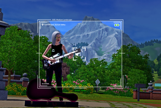
➡️ DOWNLOAD (Simfileshare, .psd files)
Instructions: These are .psd files, so you can open them in photoshop, photopea (my personal choice of editor), gimp or another similar photo-editing software Then just place your image at the bottom of all the layers You can alter the text in the boxes to whatever your needs are, I recommend referring to this page on Carl's guide to see all the photography collections which inspire the green text! :)
147 notes
·
View notes
Text
Some Tips for new DBH modders

This will have 2 sections :
1 . QUANTIC dream textures - getting them stable throughout the game
2. Handy tool I found for normal maps.
QD TEXTURES - MY TOOL KEEPS BREAKING?
this is for the 2 ppl that actually mod Detroit and want to make their mods public and usable the entire game. and don't know abt this.
As you probably know, models ( containers ) share textures. So when you update a quantic dream texture for 1 model you need to update every single container/model that shares that texture or else it'll look black and crash your game. Why? because your game is expecting the file in qd format for that container when it's a dds file now.
But I'm sure youve noticed after the 3rd or so containers texture being 'refreshed' ( inserting the texture for each use of it in the tool) it just breaks. The only way around this is to tell the game it should expect a dds format manually.
Ok enough yapping. Here’s the tutorial :
Add your texture like you normally would in the editor. Do this for only one model, u can do it for more just before it crashes if u want too it shouldn’t affect it, I haven’t tested it tho.
Enable editing for all the containers/models that use that texture. So it clones it.
Now,, Repeat these steps for every texture that needs to be made into dds format other than the ones you changed in the editor:
1.Using Rk900 (INTO_3) as an example, I swapped the connor into_2 model face texture so now we need to tell the game to expect a dds for nines face. Get the offset of nines’ face texture. It’s SUPER important that the INTO_3 container is cloned as the offset will be different.
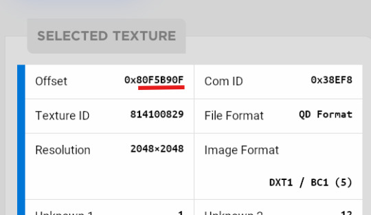
2.go to ( ctrl + g ) to the offset in d26 file. (so 80F5B90F)
3.change the following : we start at ‘0E’ for this example.
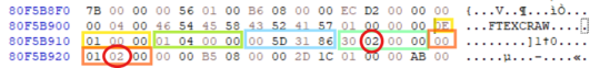
Change the 14th and 19th bytes (02) to 01 . it should look like this now
The hex code will change for each texture, but it will always be the 14th and 19th bytes.
4.Repeat for all textures and models that use them :)
Your tool will now load the containers correctly ( they will appear black still, but it will work ingame.)
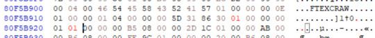
USEFUL TOOL FOR CREATING NORMAL MAPS:
Normal maps are what gives flat surfaces fake 3d-ness without actually being there ! An example of this is the pores of dbh characters. Normal maps basically allow us to use less polygons which is good for efficiency:))
How do normal maps work ? Well all digital images contain 3 color channels : Red, Green and Blue (RGB) , what normal maps do is assign x,y,z values to these channels. So red would be the x value, green is the y value , blue is the z value . These give us the fake 3d values for each pixel that alter how our game calculates the light ( surface normals ) .
I use this website to generate my normal maps from height maps :
Height maps are black and white images that tell us the height (z value) of each pixel, typically white is high,black is low. Here is an example of the sylus mask I made :

IMPORTANT!! 99% of dbh’s normal maps DONT have a blue channel ( z value) so you HAVE to remove the blue channel completely after generating it from here.
This was how my modified face texture looked like after nuking the blue channel ( in gimp you have to go to colors -> Components -> decompose and delete the blue channel then recompose it )
^^ basically i overlayed the new normal map over connors original one.
Ok thats it. idk if this helps anyone but here u go :P
Pls correct me if I’m wrong abt anything, I’m small brain tbh
11 notes
·
View notes
Text
how i (try to) make my text readable
so as a lifelong glasses wearer north of 25, i cannot see shit! I love the look of text on screenshots, but also i have spent a nonzero amount of time squinting at pale text on a busy background and thought "i cannot fucking read that."
there are lots of ways to do this. my method is not perfect. I am constantly tweaking things to try and make the text more readable. if you have suggestions about making the text more readable, please share!
Step One: Open the screenshot in your photo editor
I start with a screenshot and a script. I use Gimp, a free and open-source photo editor, and I pretty much only use it to put captions on my screenshots, so please do not ask me how to actually edit pictures, I do not know. also, please do not ask me how to do this in any photo editor, i prefer to use this one because it is free, ad-free one that I can own legally and download safely.
open-source software RULES, btw.
Step One: Add a text layer with your dialogue

I use the text tool to add the dialogue to the image, copying and pasting from my script. This is not legible. My eyes hurt. I cannot read that, so I can't tell if I've made any typos.
Step Two: Add a black background to the text.
In, Gimp: Right click text layer > "Alpha to Selection." In the top menu, Selection > Grow > 3 pixels. Top menu: Layer > New Layer. (I name the new layer "Text BG ##") Use the bucket tool to fill the selection on the new later.
There's probably a shortcut to doing this in other photo editors (hell, might be a shortcut in Gimp.)
Step Three: Blur the background

In Gimp: Top Menu > Effect > Blur > Gaussian Blur. This may be a step backward in terms of readability, but I like how it looks. Let's try a few other things to help the reader, shall we?
Step Four: Drop Shadow
In Gimp: Top Menu > Light & Shadow > Drop Shadow. Makes the text stand out a bit more. Still not particularly readable, especially the blue on blue on the left side of the image.
Step Five: Gradient layer
Create a new layer underneath the Text BG, and then add a transparent gradient over the entire image.
This is step is slightly more involved, so I'll just link you to a guide instead of explaining myself: "How to create a gradient transparency in GIMP."
Step Six: Further Tweaks

I still wasn't satisfied with the readability of the text. I duplicated the gradient layer to create a darker background underneath the text. I also repeated the drop shadow step on the Text BG layer. You could also make the text larger or bolder, change font colors, grow the selection by 4 or 5 pixels instead of 3, or skip the blurring step. I change my method frequently to try to get the best look for each individual image, and I don't always do a perfect job.
This is an area where I constantly innovate. I want people to be able to actually read my text, so I try not to let myself be satisfied with "good enough." When I take screenshots, I try to do it with an eye for compositions that give me a nice, blank space on the bottom for text, ex.


132 notes
·
View notes
Note
how do you get such good shots in cas?? :0
hey! TYSM :]
i'm not sure if you mean something specific abt my screenshots but:
- overall my gshade preset does most of the work (relight shader, the sketchbook effect i got going on rn is also gshade shader, LUT etc.) - srwe (simple runtime window editor) to resize the game's window for better quality. i almost always set the window size for the game to 3000x3000 with srwe for my cas shots. makes the game a bit laggy though. i take a bunch of screenshots with different poses, angles and distances. - i also sharpen my screenshots with gimp/rarely photoshop (i personally prefer gimp. i don't use topaz ai sharpen), add dof blur (depth of field) to my closeups, do some color grading/color mixing bc my screenshots can look a bit washed out still. i use the G'MIC Qt-plugin A LOT when editing and i think it also works for photoshop too. it's basically a collection of actions/filters for image editing and i think it's pretty neat. - i now and then change cas bg's. (i often use the black reflection bg by vyxated) but especially when i want to make a specific sim with a specific style or color story a complementarily colored background can do a lot for the overall look.
but yeah as i mentioned firstly, gshade does most of the work as u can see down below (left screenshot is unedited/right screenshot has been edited)
if u have more questions don't be a stranger hehe <3
31 notes
·
View notes
Text
basically every bit of photoshop advice is "don't use the tools any image editor has so your skills transfer, whether you use photoshop, or clip studio paint, or paint.net or gimp, use our bespoke Background Erase Tool that only we have, stay in our ecosystem"
15 notes
·
View notes
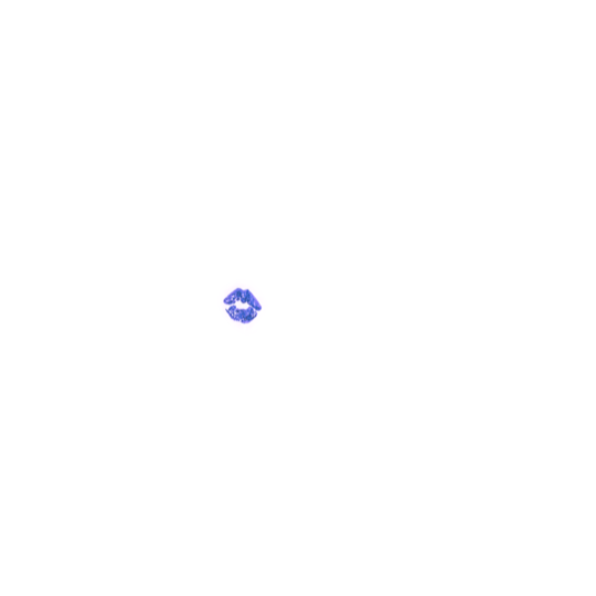
Text
Blender Guide: Editing TF2 Merc Textures with Transitions
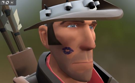


This is a guide on adding edits to the mercs' textures in such a way that the edit can fade in (for animation shots where a merc is given an injury, or blushes, gets marked by paint, etc). We'll be working on the face as an example, but this methodology can be applied to the clothes and other textures.
Making an edited texture
First, we need to make the textures.
Since we're editing the head textures, we'll want to save a copy of the head texture. Select the merc's face mesh. In the Material Properties tab, select the material slot for the merc's face texture you want to edit (example: sniper_head_red). Switch to the Shading tab at the top to see the Shader Editor. In the Shader Editor, select the Image Texture node for the merc's head (in this case, sniper_head.png). It should now appear in the Image Editor panel (if it isn't, you can select the png from the dropdown button at the top of the Image Editor). In this panel, select the three line menu button > Image > Save a Copy… In the new window, save the image.
Open an image editing program (example: GIMP is a free art program). Open the saved image. In a new layer, create the texture you want to place over the merc's face.
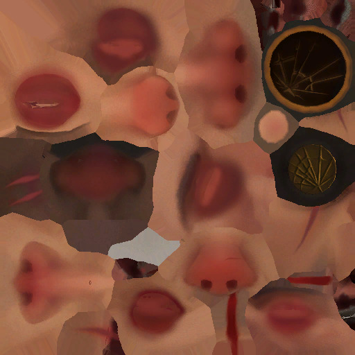
For bruises, I recommend using the TF2 cosmetic Beaten and Bruised (style 2) as reference: https://wiki.teamfortress.com/wiki/Beaten_and_Bruised You can grab its texture by spawning it in Blender using the TF2 Trifecta Blender addon and saving the texture as a png the same way you did for the merc texture.
Once you have it the way you want it, hide the merc's head texture and save the resulting image as a png. If you made your texture so that it's meant to be blended over the merc's head (examples: multiply or soft light), don't worry, there's a way to apply the blend mode in Blender.
Edit the Shader Material
In Blender, select the merc's face mesh. In the Shader Editor, select Add > Texture > Image Texture. In the newly added node, press the Open button and select the texture you made. Then add another node with Add > Color > Mix Color, adding a Mix Color node. Add in another Mix Color node so you have two.
Plug the Image node's Color to the Mix node's B. Plug the Image node's Alpha to the Mix node's Factor. Plug the Mix node's Result to the second Mix node's B. Set the node's Factor to 1.0.
Find the Image node for sniper_head.png already in the shader and plug in its Color output to both Mix nodes' A. Then plug the rightmost Mix node's Result to the Facemix group node's Color1 plug, replacing sniper_head.png's connection to it. You should now see the merc with the texture changes.

Depending on the texture you made, you may need to include some more steps here:
If your texture is meant to be given a blend mode (meaning, you used a blend mode in the art editing program earlier), you can left-most Mix node (the Mix node directly connected to the Image node) and change the Mix property to the blend mode you want (Multiply, Soft Light, etc.) in the drop-down menu.


If the texture still looks too dark/light, you can add a Gamma node (Add > Color > Gamma) and another Mix node between the first and second Mix nodes you already have. Then adjust the Gamma's value until the texture looks right.

Animating the texture
The rightmost Mix node's Factor can be keyframed on and off (with 0.0 being 0% off). To do so, hover your cursor over the number value and press your Add Keyframe hotkey (or right-clicking the value and selecting Insert Keyframe). The value should now be yellow. Yellow means the value had a keyframe on the frame you are currently on. Green means the value has a keyframe somewhere else on the timeline. Adding two keyframes of different values creates the transition.

Depending on your needs, you can make the transition instant (a merc getting kissed with a lipstick mark), or gradual over multiple frames (a merc blushing from embarrassment).
I am also including the pngs of the four example textures I used. Feel free to use them.


10 notes
·
View notes